
In the previous part of this series, we talked about choosing a base color.
Well, while that was important, I'm sure some of us were starting to wonder where the core stuff of actually creating a color guide comes in. In your defense, Part 1 was a month ago.
That's where Part 2 comes in. Here I will be talking about creating your own cohesive color palette. I'll cover choosing a good base color, picking neutrals, choosing an accent to the base color, creating balanced grays and finally applying our color scheme. By the end of this article, we should have learned how to create a simple color guide we can use in our next project.
A Quick Review
In part 1, we talked about choosing a base color and tips on choosing a base color, where we mentioned what we should consider when choosing a base color. Part of what we discussed is how we should be aware of our target audience and the inherent meaning of our base color to them, choosing complementary colors, and if possible avoid using our competitors' colors. Remember that the colors you choose can work for or against the project you're trying to create.
Choosing a Good Base Color
With our tips from part 1 in mind, we want to choose a base color. So let's say we choose purple 😀.
What's next is to find a nice shade or tint or tone of blue 😥. Cheer up, so instead of opening up a color-picker to find this shade or tint or tone of blue, we will use other people's choices to aid us. Do you mean we will grab colors from people's designs? No, we will use inspiration websites like Dribbble and Designspiration to help us out.
Go to Dribbble and Designspiration and click on the 'colors' link in both.
You should have these:
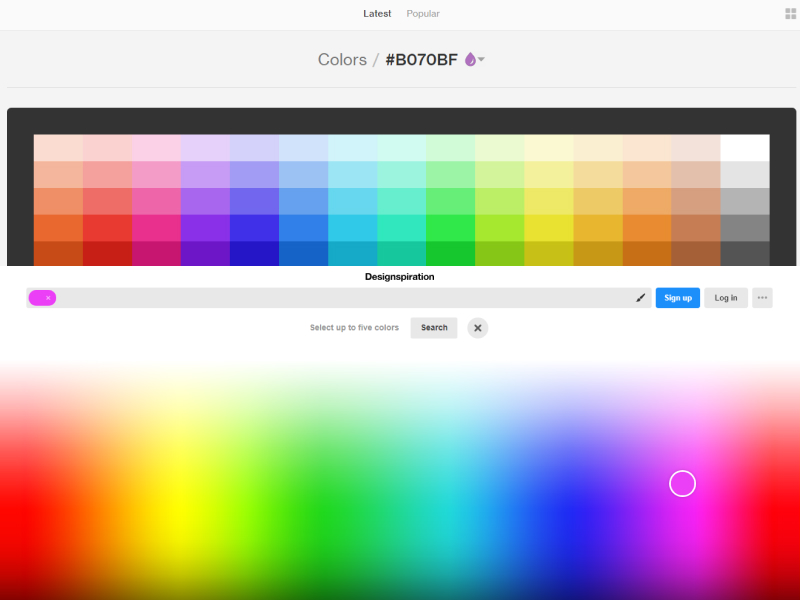
Inspiration websites to find the right base color. Dribble (up) and Designspiration (bottom)
Choose a shade from each website to see that color in use.
Apart from seeing different versions of your base color. You will also see colors that match.
Pick one that best suits your project.
Creating a Matching Color Scheme
Default Color Scheme Types
Below with examples for each are some of the predefined color scheme standards that make creating new schemes easier, especially for newbies.
MONOCHROMATIC
These color schemes are made up of different shades, tones and tints within a specific hue. They are more often than not the simplest schemes to create. But they can be boring when done poorly.
ANALOGOUS
These color schemes are created by using three colors that are next to each other on the color wheel. They all have the same chroma level, but by using tones, shades, and tints we can spice it up.
COMPLEMENTARY
These color schemes are created by combining colors from opposite side of the color wheel. Basically, they consist of only two colors, but can be expanded using tones, tints, and shades.
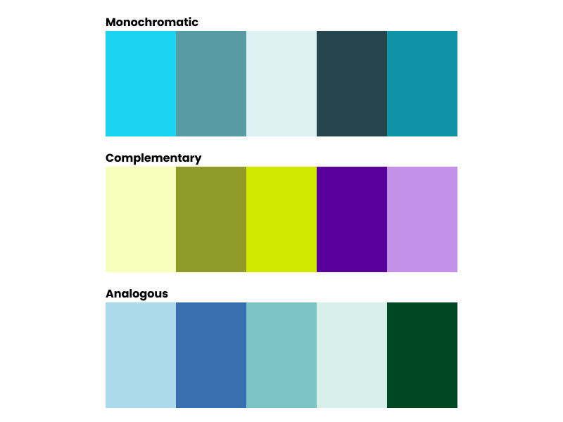
Monochromatic, complementary and analogous color schemes. (Image credit: Cameron Chapman for Smashing magazine)
Other predefined color schemes standard include:
- Split complementary
- Triadic
- Double-complementary (Tetradic)
Creating Your Own Color Palette
Finally !!! Time to create your custom color palette 🎉🎉🎉🎉
Creating your own color palette can be a bit intimidating and I know you might be thinking - Olamide, why do I need to create my custom color palette since there are already predefined ones 😒🙄
First of, creating your custom color palette is not as complicated as many people think. Also, the problem with those kinds of color schemes above is that applying it to a real design isn't very practical, and that's why we are here to know the few tricks you can use to create great color palettes.
So, for the purpose of our project here, we'll create a color palette for the onboarding of a mobile app. Our client is a Fintech mobile app.
All right, you should have a HEX value for your base color. Mine is #B070BF. We will be creating our palette from this color. So, our palette will have the following colors:
- Base color
- Neutrals: White, dark gray, and light gray
- Accent color.
GETTING YOUR ACCENT COLOR
Our accent color is the color that we use when we want things to stand out in the design. It should be used in small amounts and it is usually used on Call to actions.
To get your accent color, go to Paletton. Type in your color code into the color box
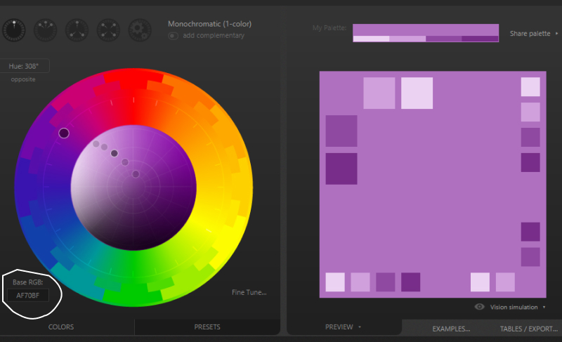
Enter your base color code in the box
To generate a accent color, you can click around the icons at the top to find a suitable color scheme. The color scheme the icons generate are based off the predefined color scheme we talked about above.
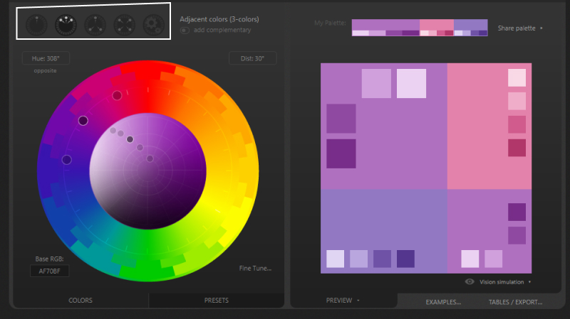
Click through to get a color scheme you like
For this project, I like the pink (topmost right color) that comes up under the adjacent (also known as analogous) icon, so that's what I'm using as the accent for our scheme.

Our color palette so far - nice base color and a shot of an accent
As our color palette is shaping up, the next phase is to add our neutrals.
ADDING THE NEUTRALS
Neutrals are an important part of creating a color scheme. Gray, black, white, brown, off-white and tan are considered as neutral colors.
Gray, black and white will take on either a warm or cool impression depending on surrounding colors.
Browns, tans, and off-whites tend to make color schemes warmer.
More often than not we need an average of three neutral colors to every scheme:
- White
- Dark gray: is usually used for text
#424242 - Light gray: I use this as a background for subtle differentiation against white backgrounds
#fafafa
You can choose your grays with the following:
- Use Dribbble and Designspiration again 😉 to find a nice gray from your previous result that matches your base color.
- You could use Erica Schoonmaker’s technique if you have Photoshop to harmonize your grays with the base color.
- You could use Olamide Jegede's (that's me 😁) method for balancing your grays.
Shameless plug- Since this is my lesson, I'll be using my method and I urge you to do the same please 🤗
BALANCING YOUR GRAYS
To create our balanced grays using Olamide's method:
- We'll start with going to Paletton and type in our color code into the color box like we did earlier when trying to pick our accent.
- Revert back to Monochromatic and click on Presets
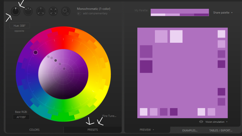
Select the icon to choose monochrome, then click on Presets to show a list of preset schemes.
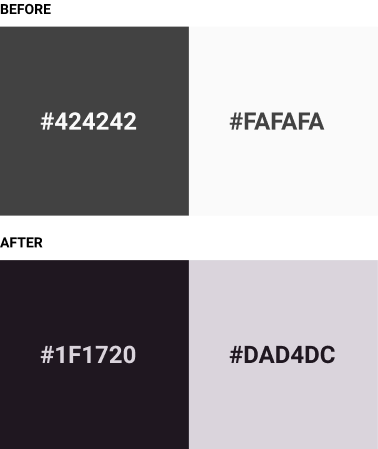
- Select greyish dark and hover on the darkest color in the scheme and write the HEX code. In this case, it's
#1F1720
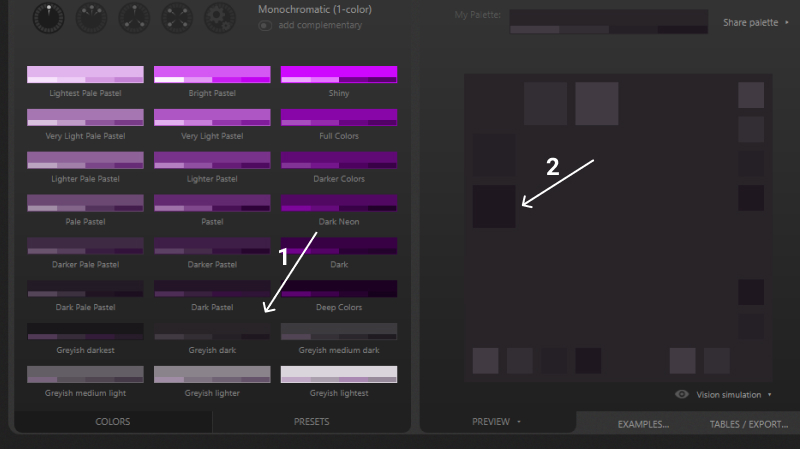
Select the greyish dark Preset and pick the color
- Click on UNDO at the top of the page. This takes us back to our original color scheme. Click on Presets again.
- Then select greyish lightest and hover on the lightest color in the scheme and write the HEX code. In this case, it's
#DAD4DC
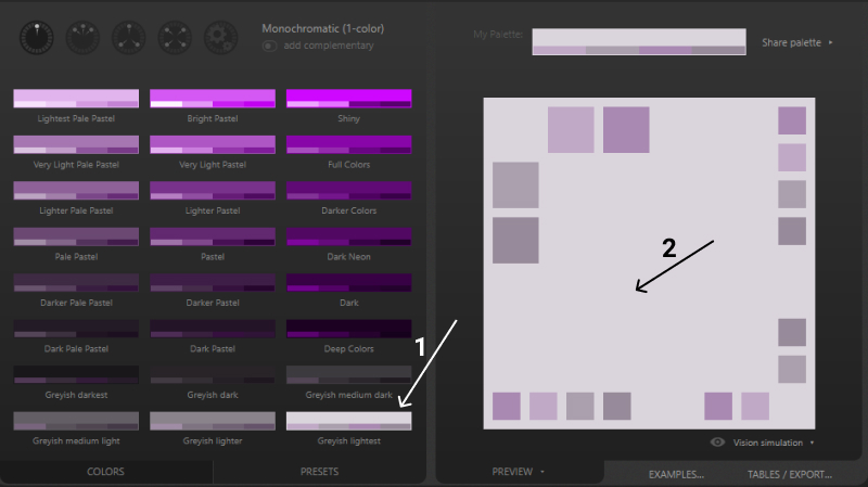
Select the greyish lightest Preset and pick the color
So yeah that's Olamide Jegede's method for balancing your grays. Nice right 👌
Picking grays that balance with the base color might seem like a small detail but it makes a nice difference.
Yes!!! We did it!!! 🎉🎉🎉
Ladies and Gentlemen, our color scheme is complete. I feel ecstatic and I hope you do too.
Presenting our color scheme:

Our glorious color scheme.
Your Color Scheme in Action
Ok, so we have finally made our color scheme, not it's time to put it to use. Here's a little tip on how to apply the colors in your color scheme to a project.
- Base color: Used for logos, call to actions.
- Dark gray: Used for headings, and body text
- Light gray: Used for backgrounds (sometimes for body text if Dark gray was used as background
- White: Used for backgrounds.
- Accent: like the name implies used as accents, in graphics (like icons, illustrations), button hover effect
Like I said earlier, the project example we will use for the purpose of this lesson is the onboarding in a FinTech payment mobile app 🤑
For an insight on the transformation that will occur, here's a mockup of the screens in grayscale and with our color scheme put to use.
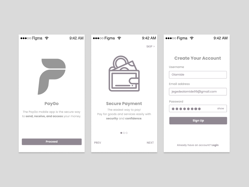
Laying it out in grayscale helps us to focus on hierarchy and layout
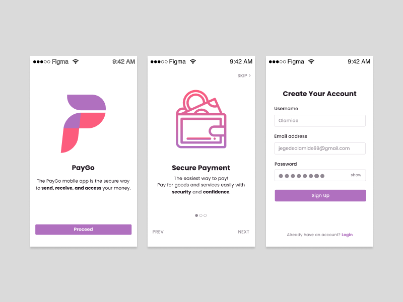
GLOW UP: courtesy of our color scheme
As you can see, purple is the base color here. It’s used on the logo and on button
Our accent, pink / pinkish - purple 😜, stands out beautifully against the base color. This is used in very small areas, for the and in the icons. The less you use this color, the more it will stand out. Less is more
The dark gray is used for the text, slider indicator outlines.
The light gray is used for the form text, the slider controls and the form-field outlines.
The white forms the background.
Keep in mind that when using color and text you need to ensure that there is sufficient contrast between the background and the text.
Why? This is because of people with color blindness or low vision read the text.
Good design is not only aesthetically pleasing, but functional and accesible - Olamide Jegede
The WebAim Color Contrast Checker is a tool to help you ensure that your colors comply with WCAG Guidelines.
Using Photos For Color Schemes
Recently, I discovered a tool you can use to automatically generate color schemes from a photo; the Adobe Capture CC mobile app.
With Adobe Capture, you can upload an image or use your camera. This is awesome for times when you might be inspired by a physical object. You can also pick an image from your Creative Cloud account or Adobe Stock.
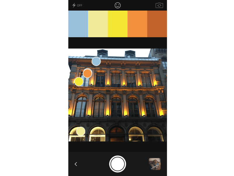
Adobe Capture CC mobile app (Image credit: Cameron Chapman for Smashing magazine)
Conclusion
You're not restricted to using 5 colors in your scheme, as long as you follow the process above it's fine to find more colors that work with your scheme.
There are sites that allow you upload your color schemes and store them for later reference, take advantage of them.
Remember the best way to be good at creating color schemes of your own is to practice. If possible, create a scheme on a daily basis or rather weekly basis.
Play around and have fun. I would like to see what you create, mention me on twitter @hola_mide and Instagram @hola.mide
This post turned out to be longer than planned. Thank you for bearing with me 👍