
“All colors are the friends of their neighbors and the lovers of their opposites” – Marc Chagall.
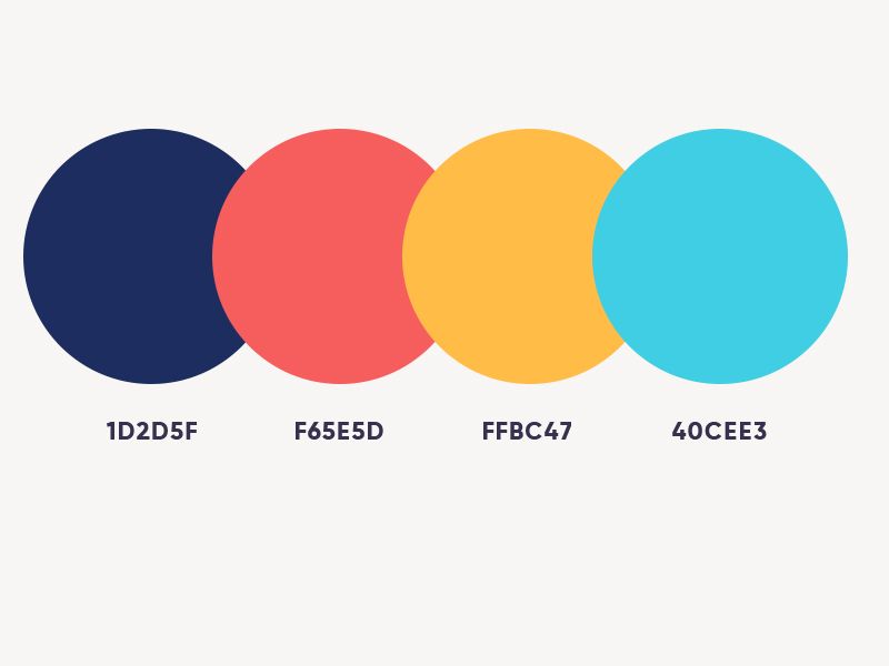
Now to pick any color from the over 10 million colors we can see at any given time can be either easy or quite difficult. But what we need to have in mind, is that this color will be the primary color for the project; that is, everything will revolve around this color.
No pressure: You can’t fail here, as I’m here to help you.
Choosing a Base (primary) color
This is one of the most important decisions when deciding on the visual interface of an app or website.
For any project involving clients, one thing that is good to keep in mind is that you’ll have to defend most if not all your choices, so you should try to have to have solid reasons that justify your choices.
Else, it will be a case of their favorite color versus your favorite color, and this is a battle you can not win as they the ones paying for the project.
All in all, what I’m trying to say is that you make sure you have some valid reasoning behind not only your color choices but all your choices.
Tips on Choosing a Base color
1. Use what you have
More often than not, if the client has a logo with an established color, that will usually be your base color.
However, note that if you decide to use the color from the logo, you can use different variants (shade or tint) of the same hue.
2. Do not use your competitors’ colors
Sometimes, there might be an urge to copy if one of your main competitors has a strong brand color, don’t do it if you can help it. Instead, find their colors and remove them from your color schemes.
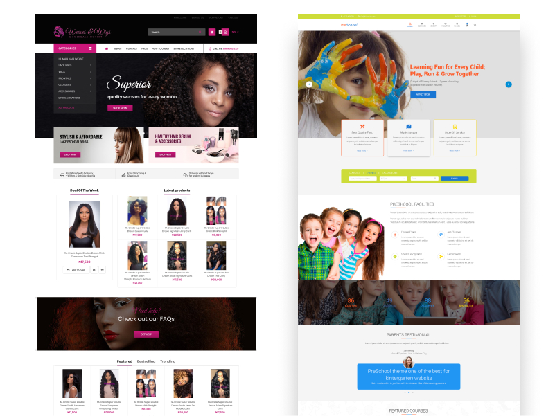
3. Consider your target audience
The colors of a website for a fashion store would likely not be the same as the colors for a primary school or a kid’s toys website.
Think about how your use of color might be perceived in other countries and cultures – Make sure the colors in your app send the appropriate message.
Think about who will be using the website and how you want them to feel (serious, relaxed etc.).
4. Use complementary colors
Colors in your app should work well together, not conflict or distract. Use complementary colors throughout your app or website.
5. Use sufficient color contrast ratios
Lack of sufficient contrast in your app or website makes content hard to read for everyone.
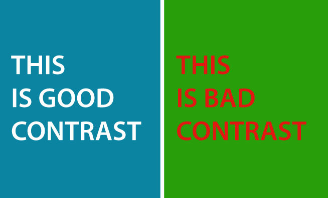
Consider using an online color contrast calculator to help you accurately analyze the color contrast in your project to ensure it meets optimal standards.
7:1 is the preferred ratio because it meets more accessibility standards. Try to achieve a minimum contrast ratio of 4:5:1.
This is the first article in the series: A Simple Color Guide for Web Projects