
As defined by MDN, Cascading Style Sheets (CSS) are a stylesheet language used to describe the presentation of a document written in HTML or XML (including XML dialects like SVG or XHTML). CSS describes how elements should be rendered on screen, on paper, in speech, or on other media...
One of the problems faced by starters in web development is how to arrange content using css on the web to fit the screen sizes of any device. With css floats you can achieve layout and positioning easily. As a starter to front-end web development taking your time to understand how to use CSS floats to achieve a grid system is super helpful for a strong CSS foundation.
Basics
Normal Flow
The normal positioning for HTML elments in a webpage is the same way they are written in the HTML code i.e from top to bottom and left to right, the flow wraps depending on the space available on the screen.CSS postioning allows us re-organise these HTML elements regardless of their position in the normal flow.
CSS Positioning
Positioning simply refers to the layout of the items on your page.The CSS **position** property specifies the type of positioning method used for an element. The most used values of the position property are:- static
- relative
- absolute
Read more about CSS positioning here
The Box Model
It is necessary to understand how the CSS Box Model Works before explaining how to use CSS to arrange elements. HTML elements can be considered as boxes. The term **box model** is used when talking about design and layout. The CSS box model refers to the space dimension of HTML elements which is usually of a box shape. This box shape dimension consists of: the actual content of the HTML element and its margin, border, and padding.The box model also determines the spacing of elements in relation
to other elements.
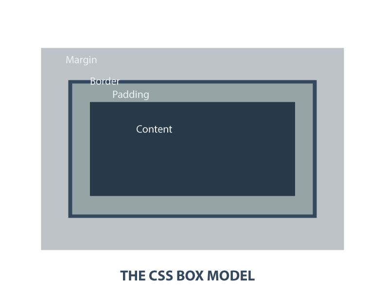
When you specify the width and height properties of an element with CSS, you are just setting the width and height of the content area. To know the full dimension of the element, you must also add the padding, border and margin. That is:
- Total element width = defined width + left padding + right padding + left border + right border + left margin + right margin.
- Total element height = defined height + top padding + bottom padding + top border + bottom border + top margin + bottom margin.
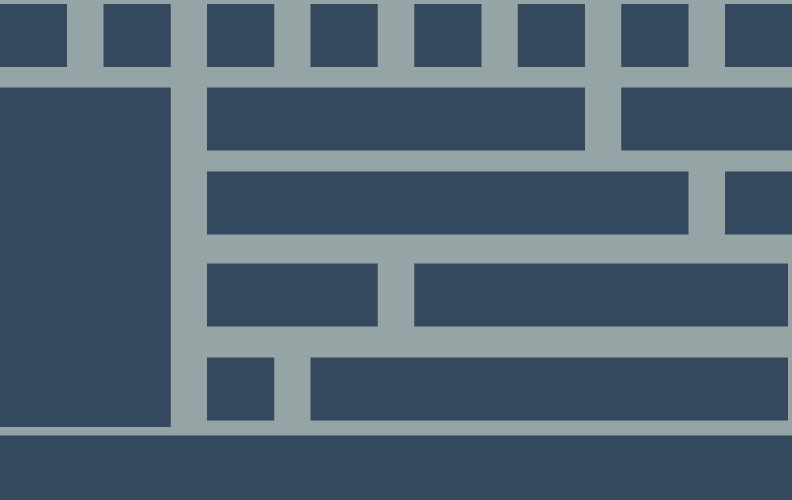
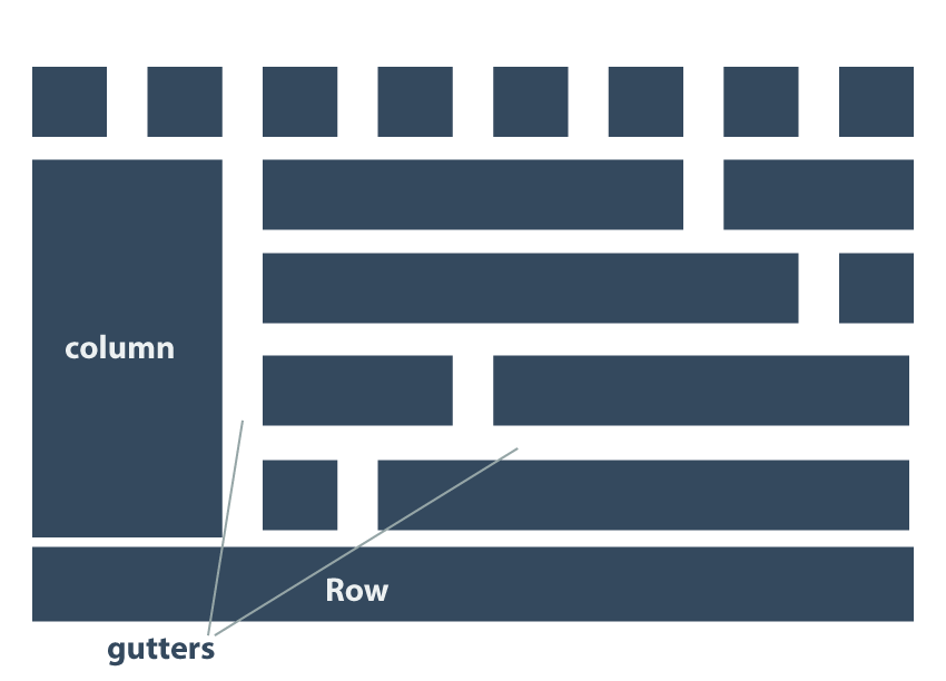
Grids
In the world of design, a grid is a series of vertical and horizontal lines that can be used to specify vertical (columns) and horizontal (rows) sections of an art-board. Grid also refers to the space (gutters) between individual columns and rows.These sectioning helps ensure visual consistency between elements.
The Container
As the name implies, the container houses the grid. Think of it like a warehouse filled with stacks of boxes. In css, the container takes the entire width of the page (i.e. 100%). Maximum width is then set to accommodate Lager displays.The css box-sizing property ensures that columns remain in the container after padding and floating.