
This is not something that is often talked about, but when designing web content with images, art direction can go a long way to help keep the user engaged. Apart from the general look and feel of a page, there is also a need to ensure that a viewer transitions as smoothly as possible through the content in whatever direction we want them to move.
You must have experienced the concept at work here a lot of times. Remember watching your favourite team play and when a player is running with the ball from the right, the camera-man tries to angle the shot so there’s lot of space on the left side of the screen. The player seems to be running into space. This effect is based on a photography composition technique known as the rule of thirds.
The rule of thirds is one of the basic compositional tools at your disposal, and one of the easiest to master. Basically, you are breaking your photograph into thirds, both horizontally and vertically. This will leave you with 9 equal rectangles, as you can see below.
The theory is that points of interest placed in these intersections help your photo become more balanced. It creates more tension, energy and interest than simply centering the subject or object.
Conducted studies show that the viewer’s eyes will naturally fall to these points in an image subconsciously. Your image instantly becomes more dramatic.
We can apply the same technique to images on your website, with a little art direction we can place subtle emphasis on particular content or the flow we want your users to follow in reading our content.
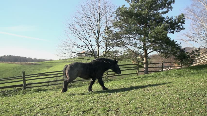
For instance, here's a picture of a horse. Nothing special about it.
Here's our image, cropped a bit.
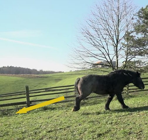
Look's odd, doesn't it? The eye is forced to move unnaturally away from the direction of the horse's movement. Here's the horse again, cropped differently this time.
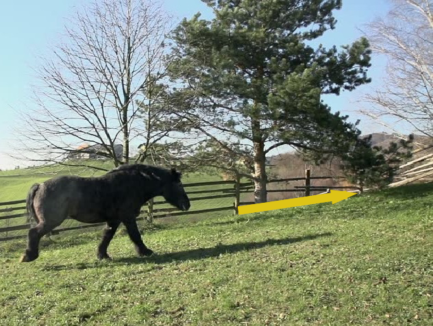
Re-cropping an image to provide some space in the direction we want the user to follow, guides the eyes into that space, creating that natural feeling of movement.
The rule of thirds technique used to this effect on the web was named aptly by Mark Boulton as the looking room effect in his 24ways article.
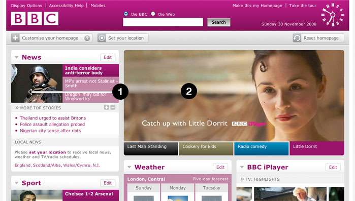
Image credit: 24ways.com
With the content section to the left of the looking room, attention would transition from right to left on the page. Elements are placed in decreasing order of priority for the viewer to apprehend.
This small technique is a great winner on the web, so whether you are taking your own pictures or editing images doing it with a looking room pays off.